


Radiant Design System
Year
Collaborators
Internal team: 3 total UXers, support from UI, Digital Strategy, Account, Project Management.
Keywords
Design systems, component design
Year
2024
Collaborators
FCB UX: Spyridon Alexopolous, Megan Sanders, Julia Pfatteicher, Jennifer Bacani. Additional support from FCB Digital Team.
Keywords
Accessibility, design system utilities, Figma libraries and plugins
Radiant Design, also known as Discover Design Language System (DDLS) 2.0, is an upcoming design system for the Discover Card ecosystem. On the Radiant team, I work closely with my fellow UI/UX designers as well as account executives and product managers in a fast-paced sprint environment. Together, we research, define, design, and deliver the components, patterns, and design foundations that comprise this comprehensive and sophisticated design system.
My role:
UX Architect
My tasks:
• Research, test, and refine new and existing components
• Develop expertise in industry-standard design systems
• Collaborate with UI designers to create detailed guidelines for component behavior
• Ensure accessibility in approved designs through meticulous annotation
• Stay current with the latest developments in digital accessibility through conferences and research
Getting started
Onboarding
Discover’s design system needed a refresh. Although the system was cohesive in its reflection of the Discover brand identity, there was room for improvement in documentation detail. Digital accessibility could also be improved for the benefit of this banking apps diverse users. FCB’s Digital Products team was brought on to develop a design system that could modernize Discover’s app and website: and the results were Radiant (...sorry).
My first role on the Radiant taskforce was researching accessibility: once a component’s fundamentals passed through the initial client approval check, I created through WCAG-informed guidance for content authors and developers. Later on, I started leading research for new UI components, orienting UI designers to each component’s guidelines and standards.
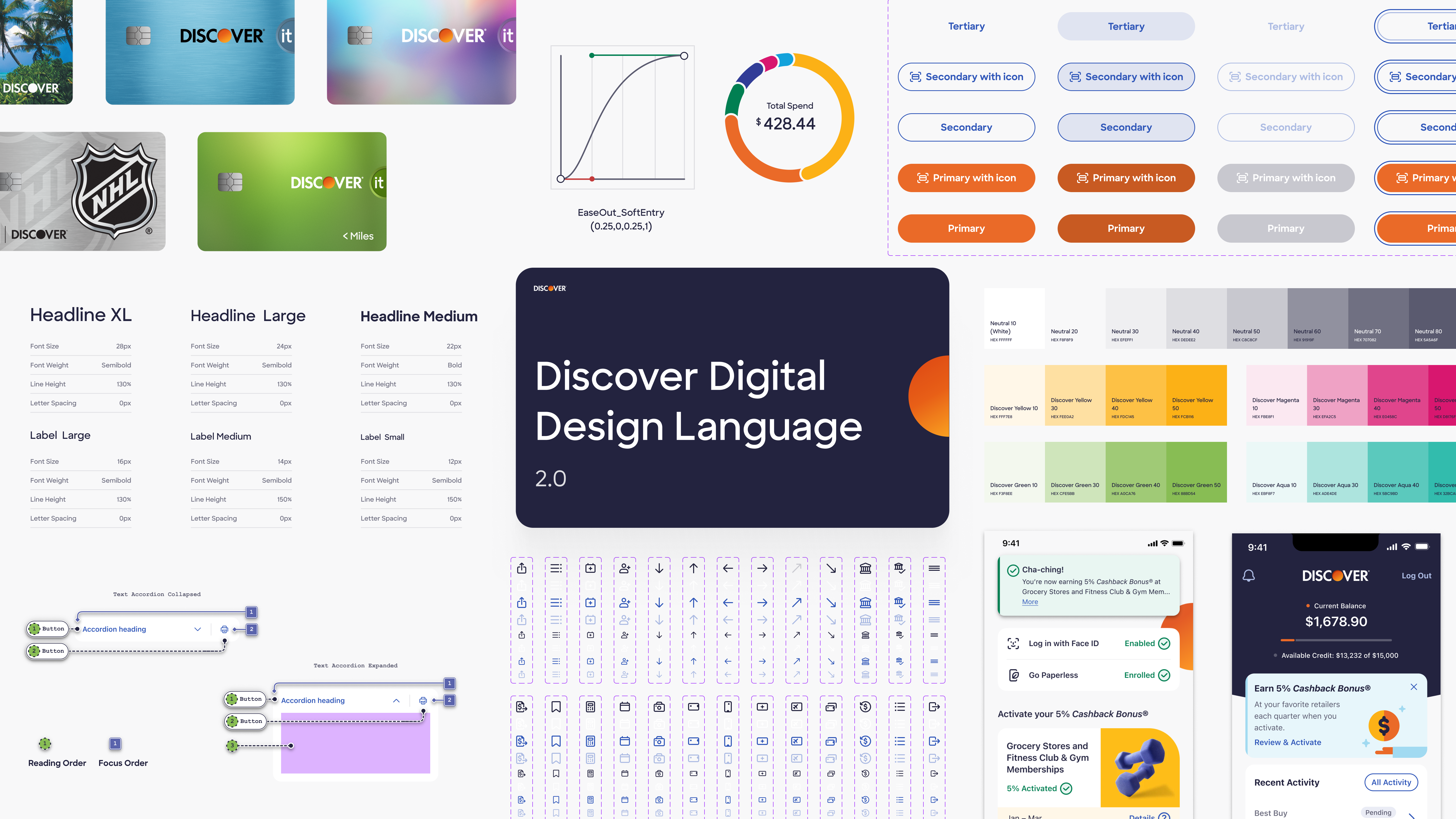
Design System Architecture
Radiant is a multi-platform design system, with libraries accounting for iOS and Android. Browser support is described in the documentation for each component and pattern when divergent from app experiences.
There are three primary design system libraries: components (split into iOS and Android), UI foundations, and utilities.

For a deep dive into my work with utility libraries, see Annotation toolkit case study.
UI Foundations
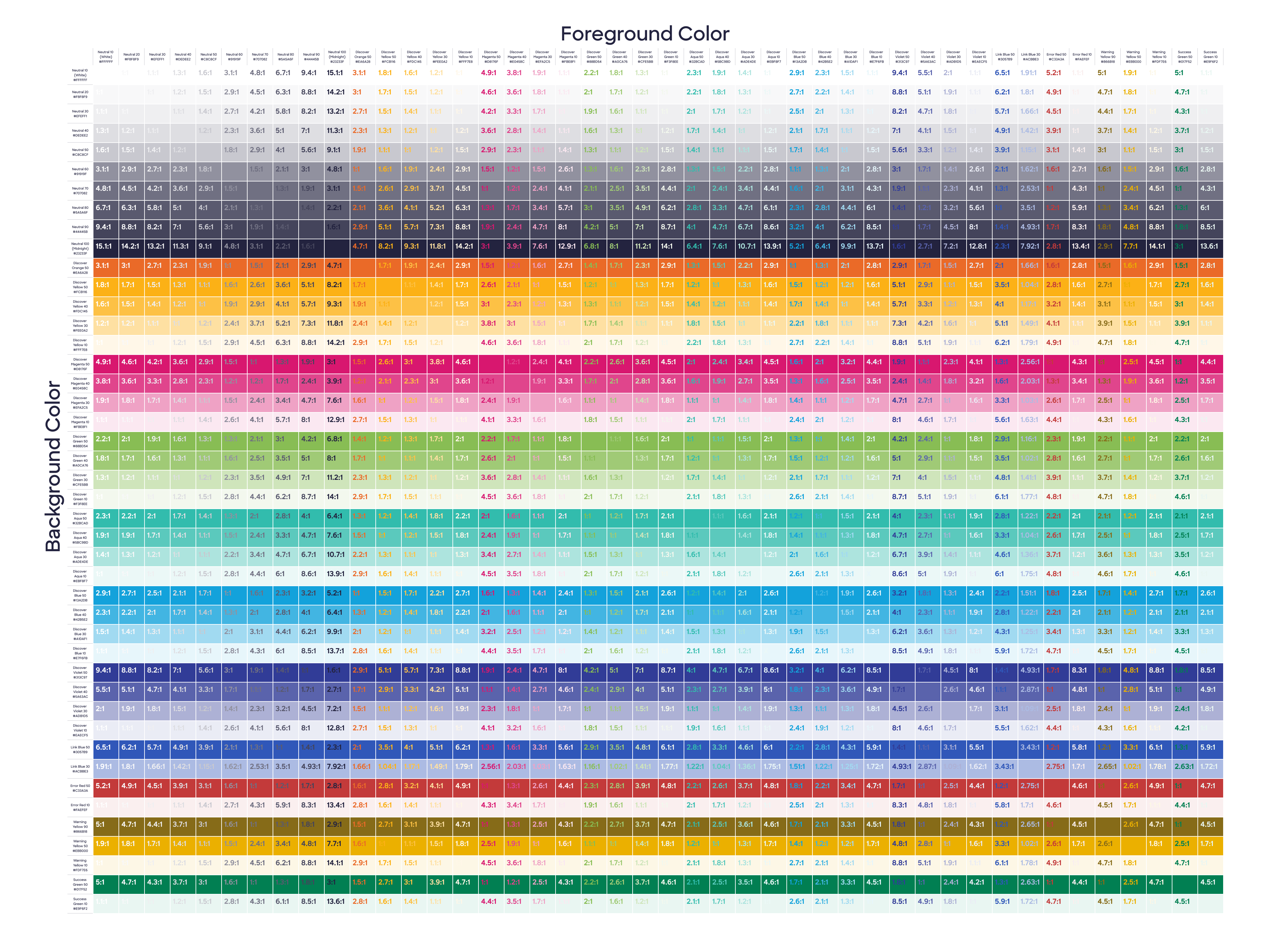
UI foundations are the building blocks of the design system. They include color palettes, typography, spacing, and other foundational elements that define the visual language of the system. During my time on the team, we began integrating design tokens into our workflow. Two tiers of tokens store primitive values, and then add specificity of usage. Design tokens are synced with Figma as variables and connected to color, typography, and effects styles.
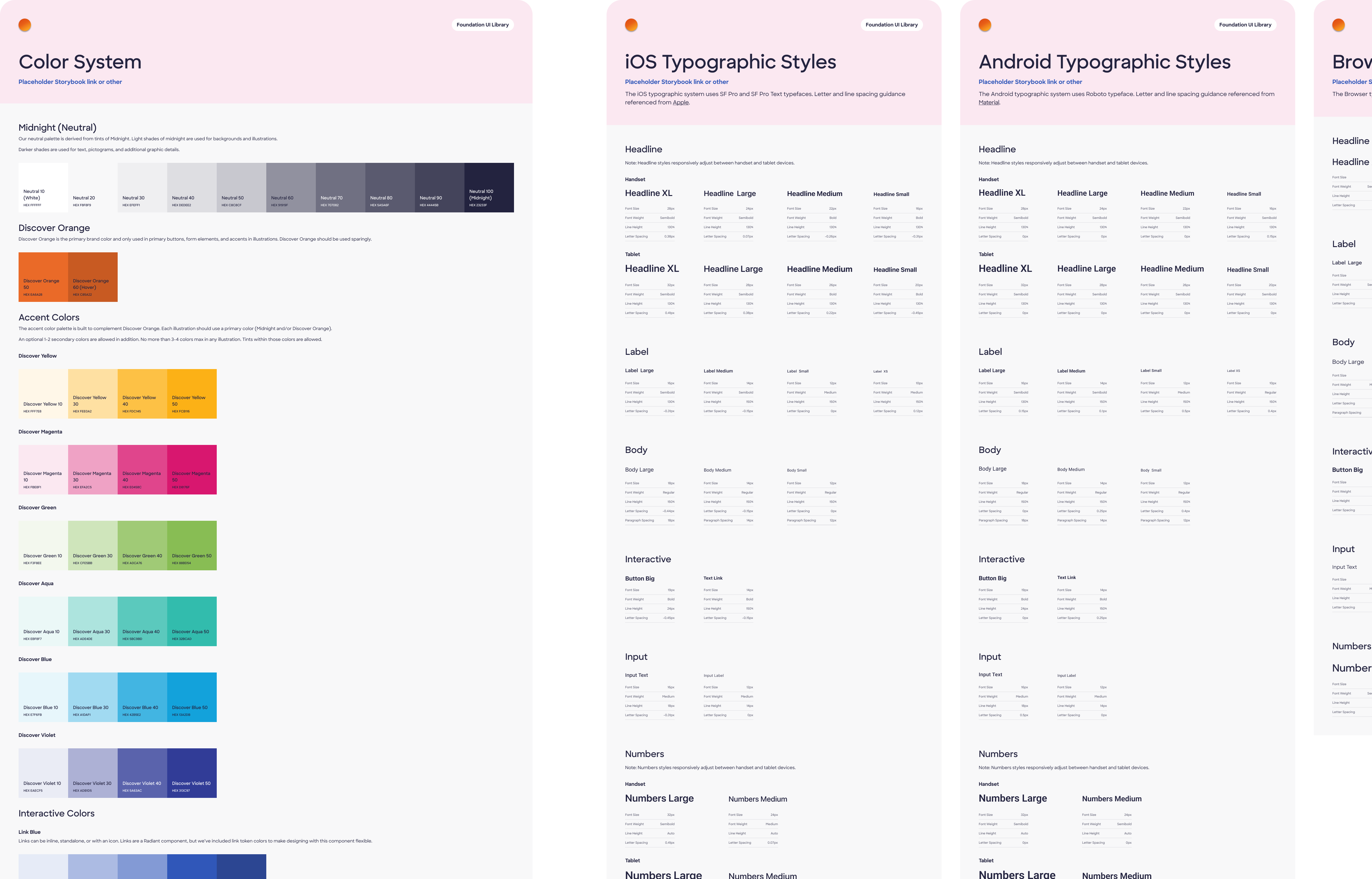
We took great pride in accounting for accessibility in our design system. This included ensuring that all color contrasts met WCAG standards, and that all UI components were fully accessible to users with disabilities.
Component Research and Design
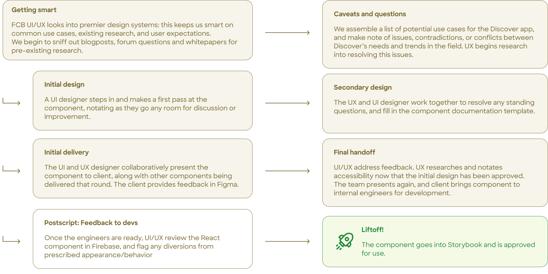
Getting organized
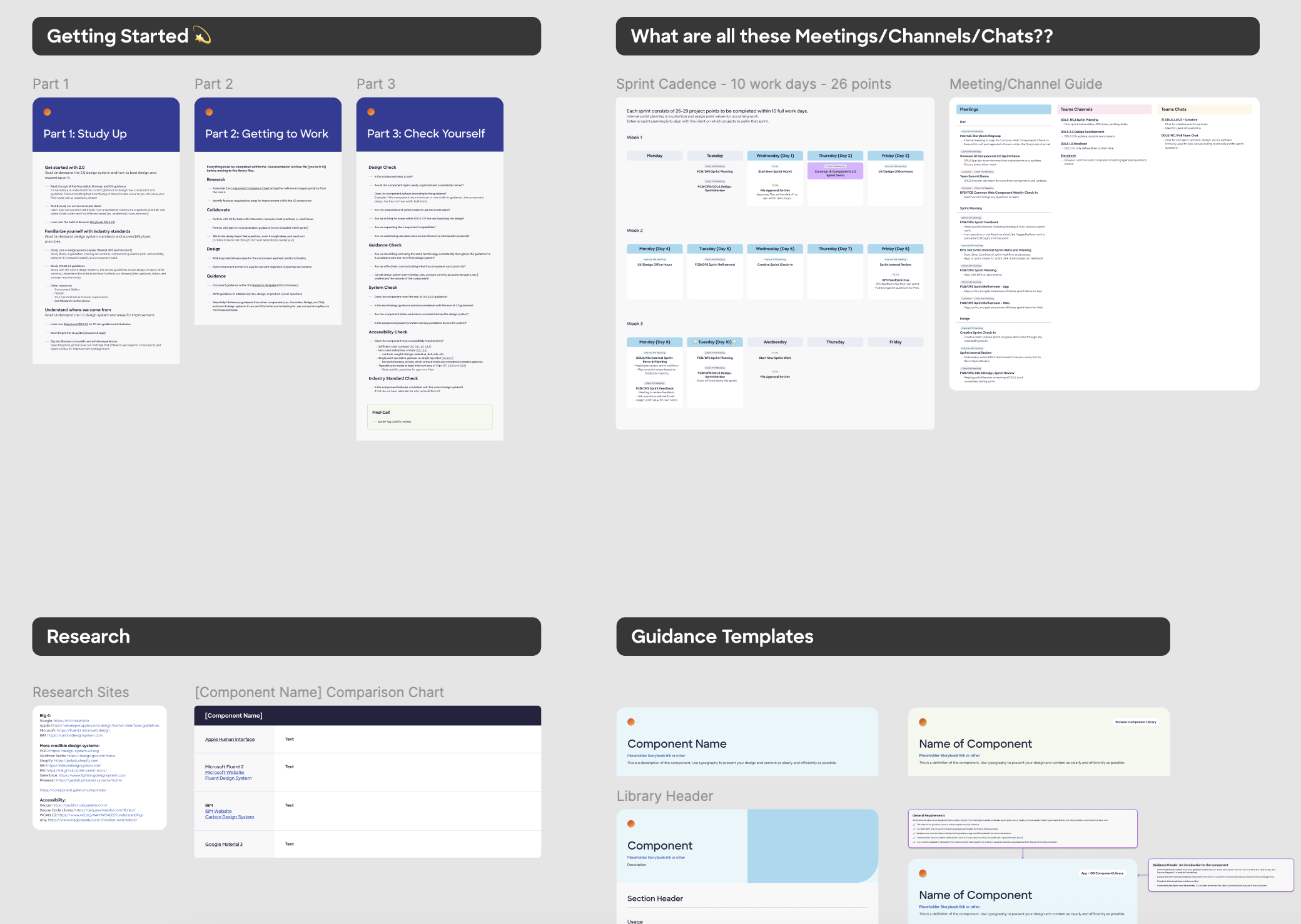
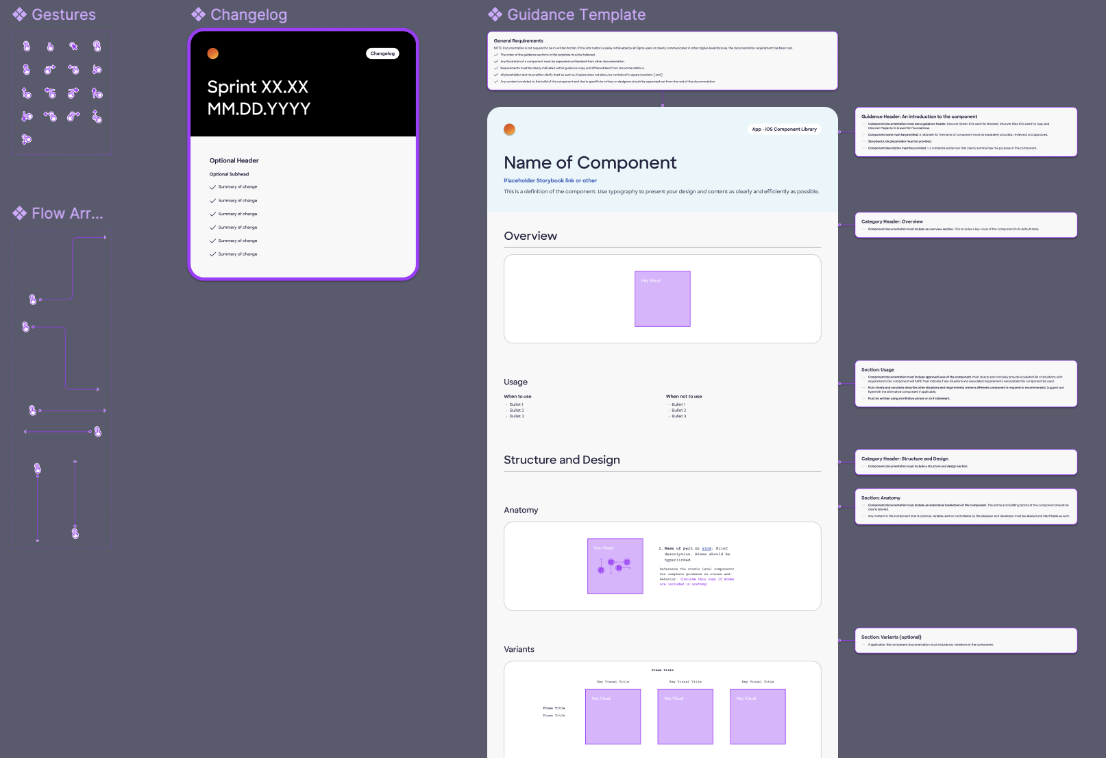
Beyond visual design, we were tasked with researching and designing over ## design system components. To keep track, we started work in a research file, where we used templated research documentation to maintain consistency and clarity across all component research efforts. Every stage of Radiant Design was considered. We wanted a highly organized workflow to account for the complexity of the project.
Our process docs were key: everything was documented and shared across teams. This ensured no information was lost and new team members wouldn't be left behind.

Research
Once all our ducks were in a row, we conducted extensive research on existing UI components from the existing design system to ensure that our new and improved 2.0 design system was both functional and user-friendly. This involved analyzing user behavior, identifying common patterns, and documenting best practices for component usage.

For a deep dive into my research and design process for a single component, see Skeleton Loader case study.
Impact
During my time on the Radiant team, he new design system was launched for the app landing page, AC (Account Center) Home. However, the Discover app (and Radiant with it) has been sunset, due to Discover's acquisition by Capital One.
Our wins:
• The new design system was well-received by the client and users, with positive feedback on the improved accessibility and usability of the components.
• Internal efficiency: We massively scaled up our internal efficiency. Our rigorous, thorough process could now be extended to all our future work.
• Accessibility: The Discover app was made more accessible for users dependent on technology like screenreaders and keyboard navigators. I'm proud to have made accessing financial information easier and more equitable for all users.
Learnings and Takeaways
• The importance of documentation: Thorough documentation was key to our success. It ensured that everyone on the team was on the same page and that no information was lost during the design process. This level of thorough attention to detail was a worthwhile challenge during my earliest days on the team.
• The value of research: Our extensive research on existing UI components was crucial in ensuring that our new design system was both functional and user-friendly. My working knowledge of building with both Figma and code increased rapidly, inspiring me to start building my own systems. (see: this website!)
• The impact of accessibility: Designing with accessibility in mind gives my UX work a broader reach and a more distinct sense of purpose. I now have a the WCAG principles deeply integrated into my process and work ethic: I'm proud that equity and access is at the heart of everything I do.
Additional links: