


Skeleton Loader
Year
Collaborators
UI designer, PM, agency design system team
Keywords
Accessibility, design system utilities, Figma libraries and plugins
Year
2024
Collaborators
UI designer, PM, agency design system team
Keywords
Accessibility, design system utilities, Figma libraries and plugins
Context & problem

For a bird's eye view of the system within which this atomic component belongs, read about the Radiant Design System.
The Radiant Design System — built for Discover's consumer financial app — ran on an agile sprint model. After each sprint, designers handed off finalized components to developers, who pulled from a deep backlog of component stories.
The skeleton loader was a net-new component: nothing existed in the 1.0 system to reference. It's an unusually liminal object: it exists only during load states, standing in for content that isn't there yet. That invisibility makes it easy for the system to underspecify how the page will present, leading to a user closing out or dropping of the experience. The question for us as UX designers wasn't just "what does this look like," but rather a ladder of questions:
- — When it appears and disappears
- — How it replicates loaded content
- — How it moves and animates while present
- — Whether accessibility guidelines should apply to something that's never truly interactive
This meant a deeper investigation into API calls, accessibility requirements, and comically existential questions regarding how one designates the usability for a transient, fundamentally disabling event.
My role
I owned this component end-to-end — the first design story I led independently at FCB. My responsibilities included:
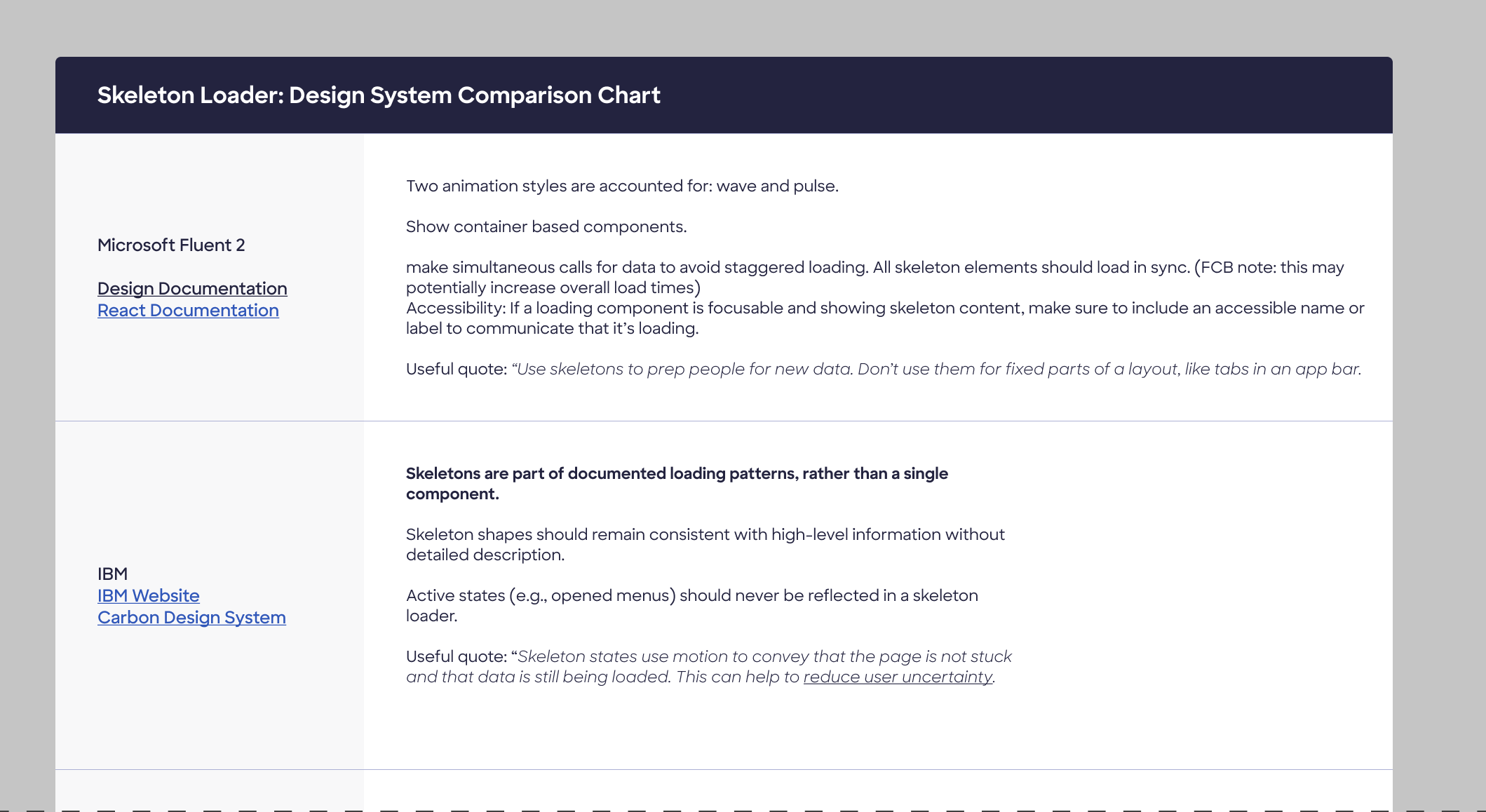
- — Conducting comparative research across the Big 4 design systems (Material, Fluent, Carbon, Apple HIG) and synthesizing findings into actionable recommendations
- — Defining specific use cases in the Discover app architecture
- — Writing animation and color contrast recommendations to hand to the UI designer
- — Reviewing UI designer's component build and calling out any digression from recommended behavior
- — Authoring the full accessibility documentation on the approved design
- — Presenting to our client, Discover's internal design system team, across our three-stage review process: research check-in, design review, and final guidance recommendations
Key research items included use case definition, animation direction (shape and timing), color contrast & WCAG ambiguity, and progressive population vs. batch swap: do skeleton items transform into page content all at once, or as the API calls in each item?
Research insights
The "Big 4" design systems (Material, Fluent, Carbon, and Apple Human Interface Guidelines) are a helpful jumping-off point. I got smart on skeletons by jotting down notes and observations from public documentation by leaders in the field, then drilled down to specific questions via published UX research and accessibility guidance.
Use case definition
When and why is a skeleton better than a spinner?
Based on existing app architecture, skeleton loaders are appropriate for loading full pages of dynamic content between experiences: the AC Home landing page, and transitions into features like Spend Analyzer. Not every loading state warrants one — simple spinners suffice for smaller, scoped loads.
Animation direction
Should the skeleton be animated? What should that look like?
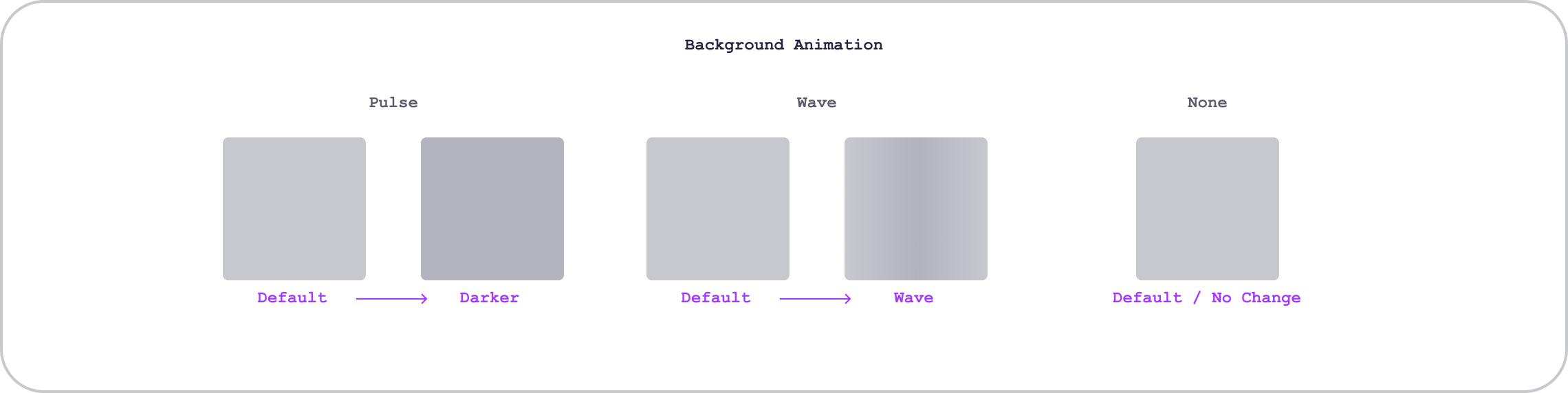
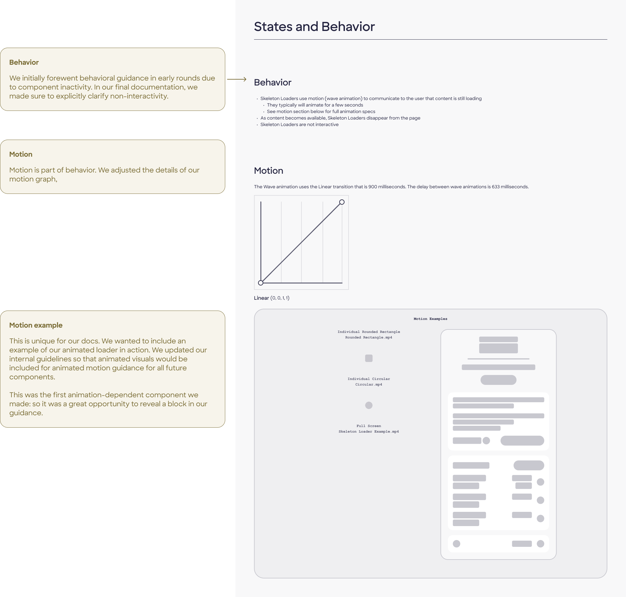
Per UX Collective research, 68% of users perceived a wave animation as representing a shorter wait time than a pulse. Left-to-right wave was perceived as faster than right-to-left — likely because it mirrors natural reading direction, reducing cognitive load.
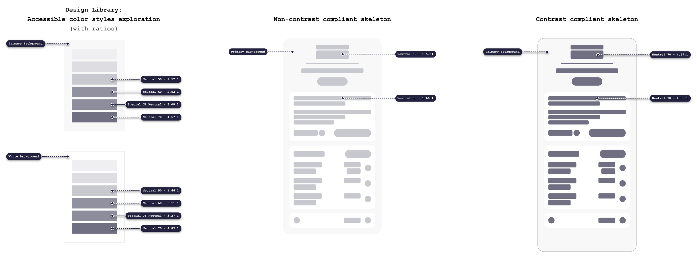
Color contrast & WCAG ambiguity
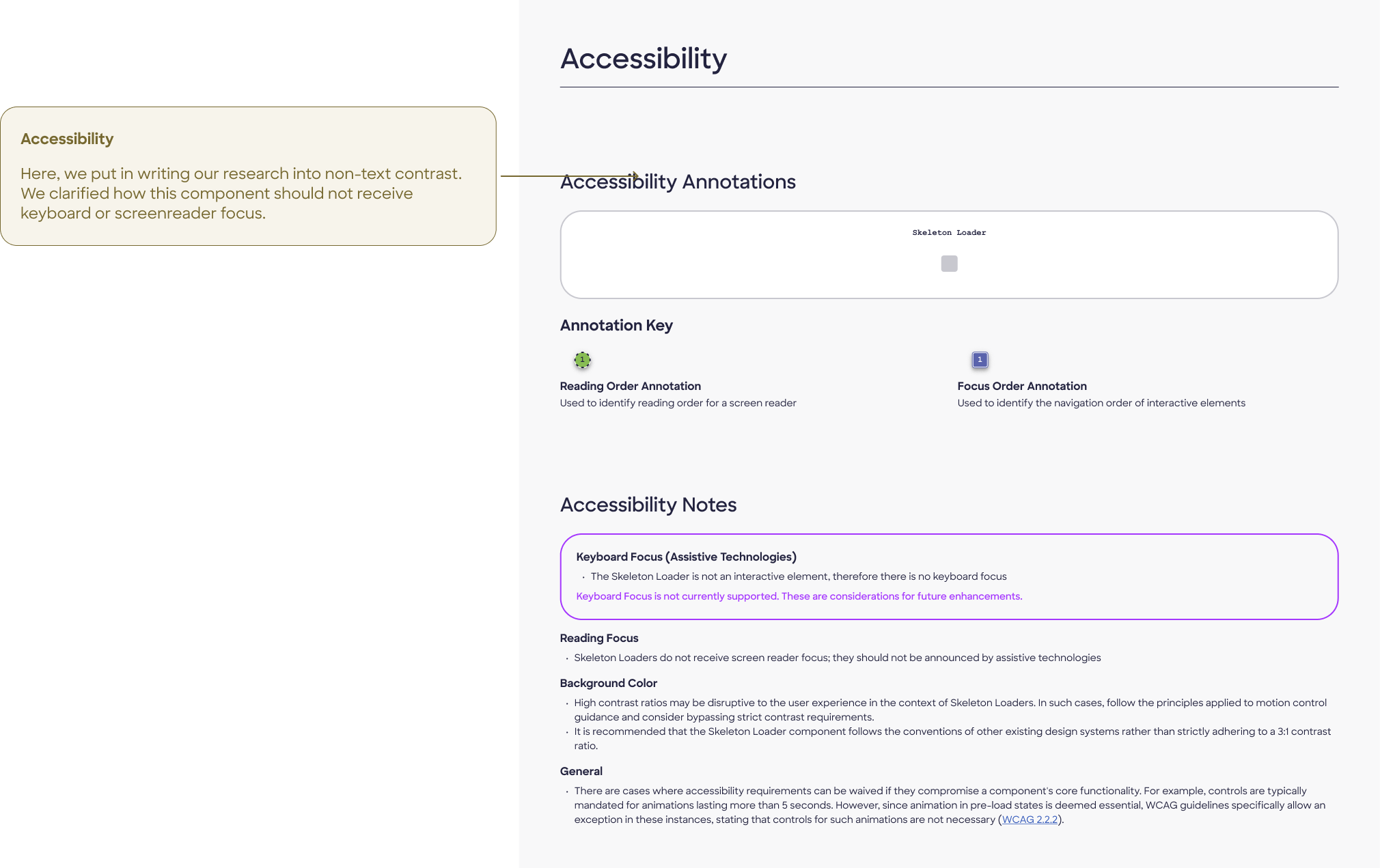
Do visibility laws apply to unloaded content?
WCAG 1.4.11 (Non-text contrast) requires a 3:1 ratio for UI components and states. However, the skeleton loader occupies a grey zone: the overwhelming majority of major apps and design systems use ratios below 3:1. Accessibility blogger Adrian Roselli argues most skeletons are technically inaccessible, but no consensus exists on enforcement.
Progressive population vs. batch swap
Does the skeleton load in as the API calls in each object? Or does the full page appear at once?
UX Collective research recommends progressively populating skeleton slots as content becomes available, rather than holding the full skeleton until all content loads — diverging from Carbon's "hold until complete" pattern.
Design decisions
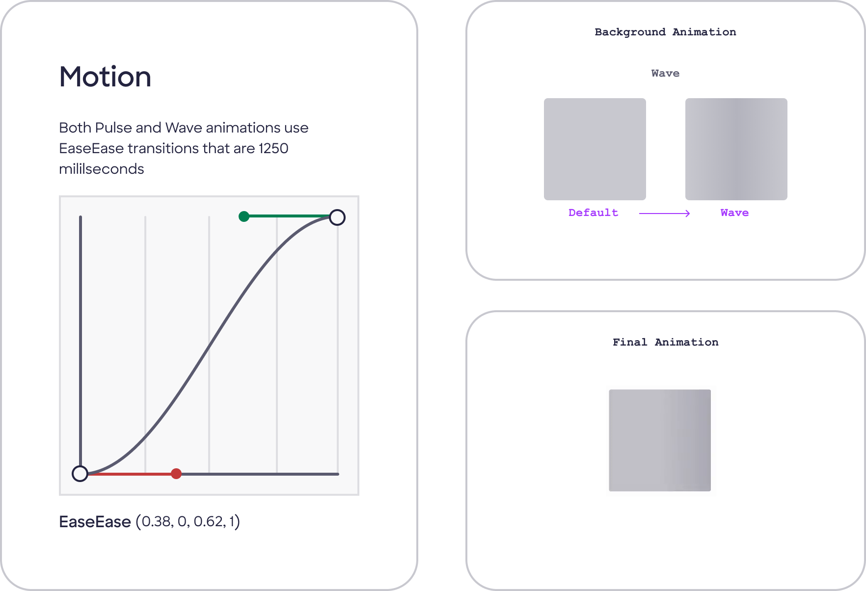
Wave over pulse
Wave animation, moving left-to-right and top-to-bottom. Research showed users perceive wave animations as faster. Matching reading direction (LTR) reduces cognitive friction. We made a single animation recommendation rather than accounting for both, given the component's limited usage.
Our motion recommendation
A wave animation, animating top-to-bottom and left-to-right, using grayscale geometry only.
Below 3:1 contrast — intentionally
Skeleton colors do not meet WCAG 1.4.11's 3:1 contrast requirement for graphical components. A skeleton that meets contrast requirements risks being mistaken for loaded, interactive content — creating worse usability than the accessibility compromise. We categorized it as an inactive component. This was a defensible, documented decision, not an oversight.
Our build uses neutral grayscale with no color, no text, and no iconography. The skeleton's job is to imply structure without conveying content. Color would suggest real information, which doesn't exist yet.
Our color contrast recommendation
Harsh contrast for an inactive skeleton goes against user expectations. The skeleton may be mistaken for loaded and thus interactive content. Therefore, the skeleton loader can be considered an inactive component, and color styles do not need to adhere to visual accessibility guidelines.
Progressive population (not batch swap)
We spoke with developer stakeholders on the client end about their API, and confirmed the app calls in content progressively. We diverged from Carbon deliberately here, citing the research basis.
Our population recommendation
Skeleton slots fill as content becomes available, not all at once. This aligns with UX Collective findings, and it feels faster.

Build
Early designs
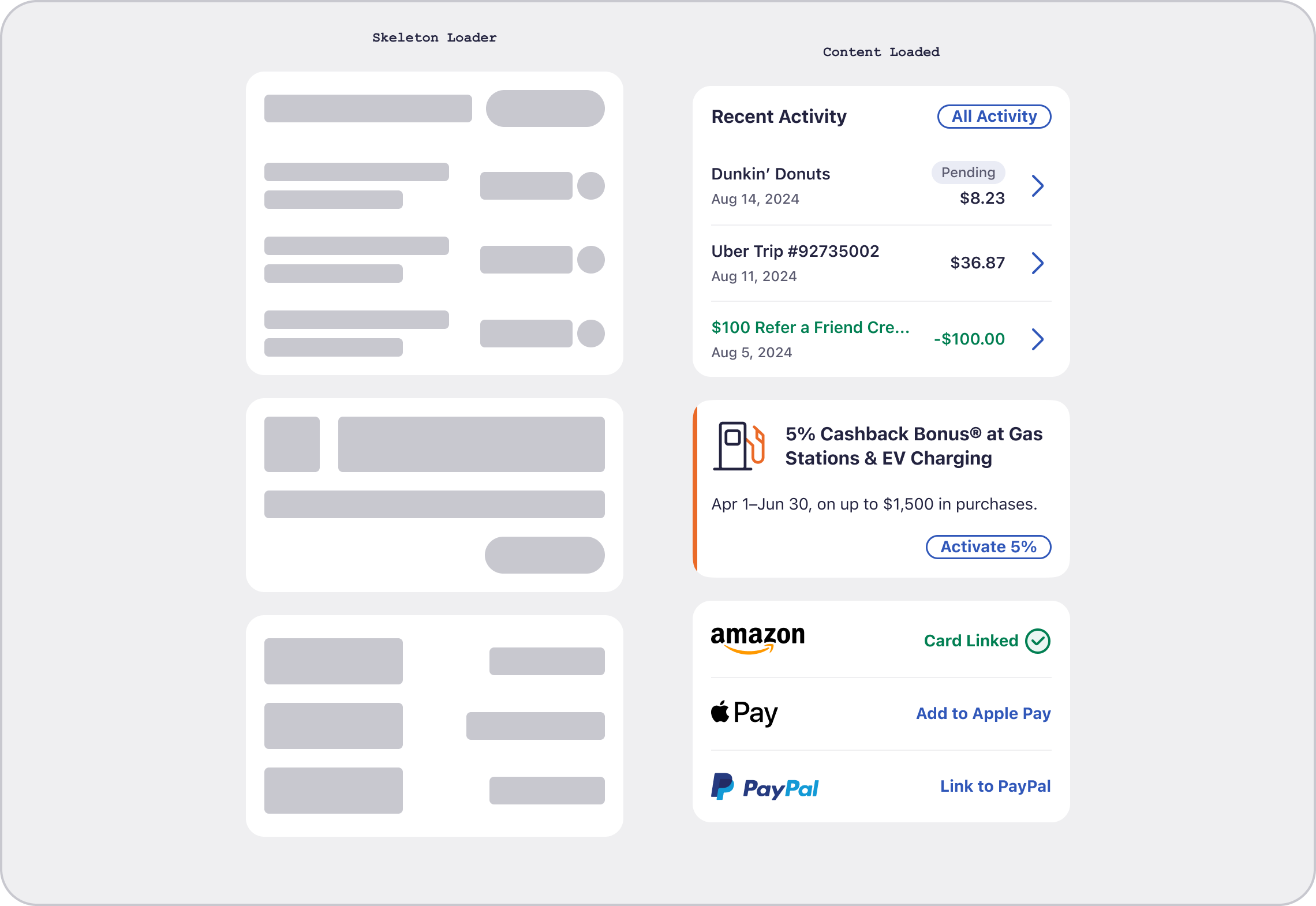
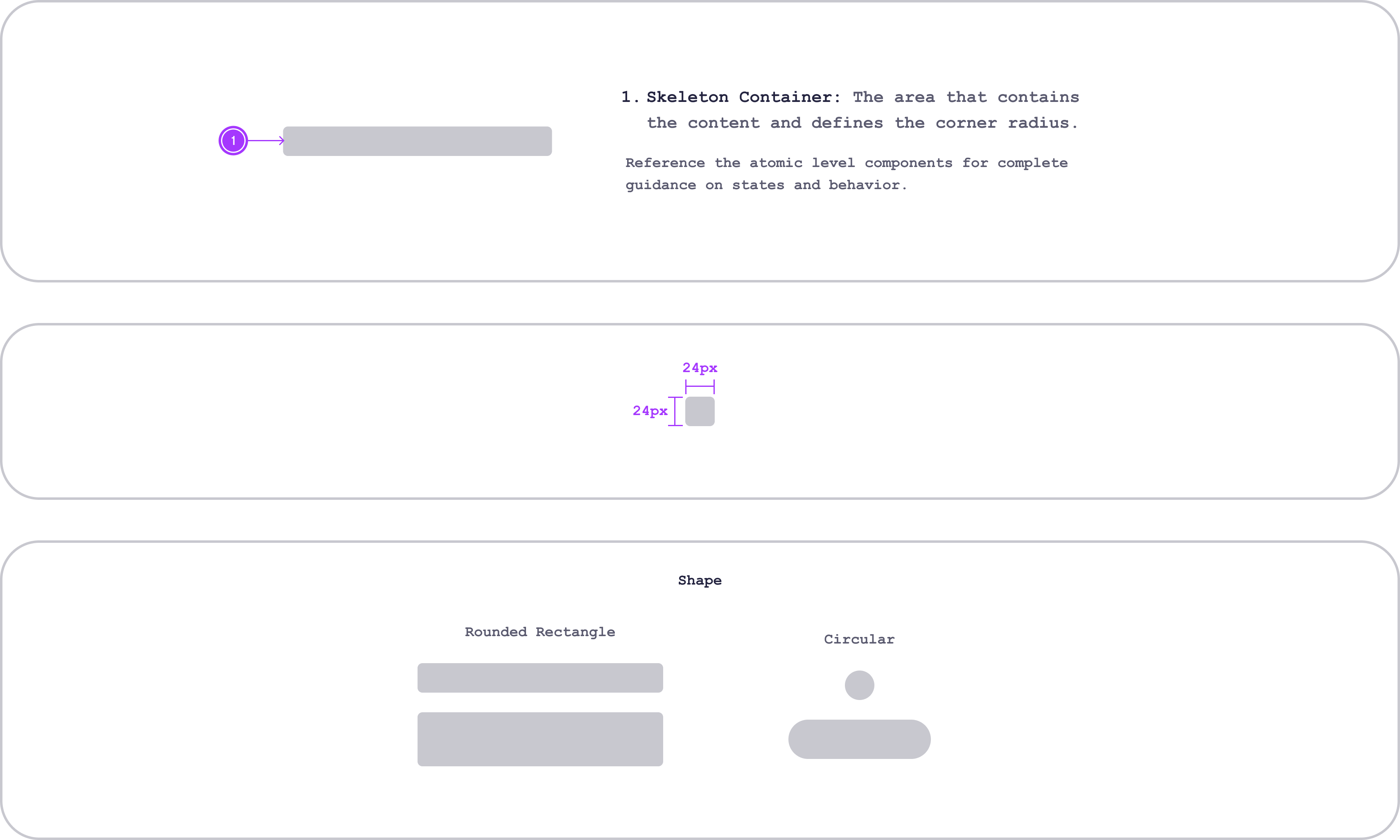
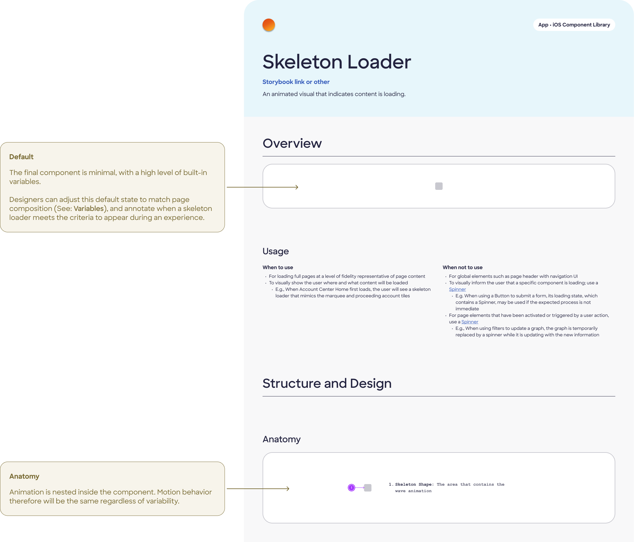
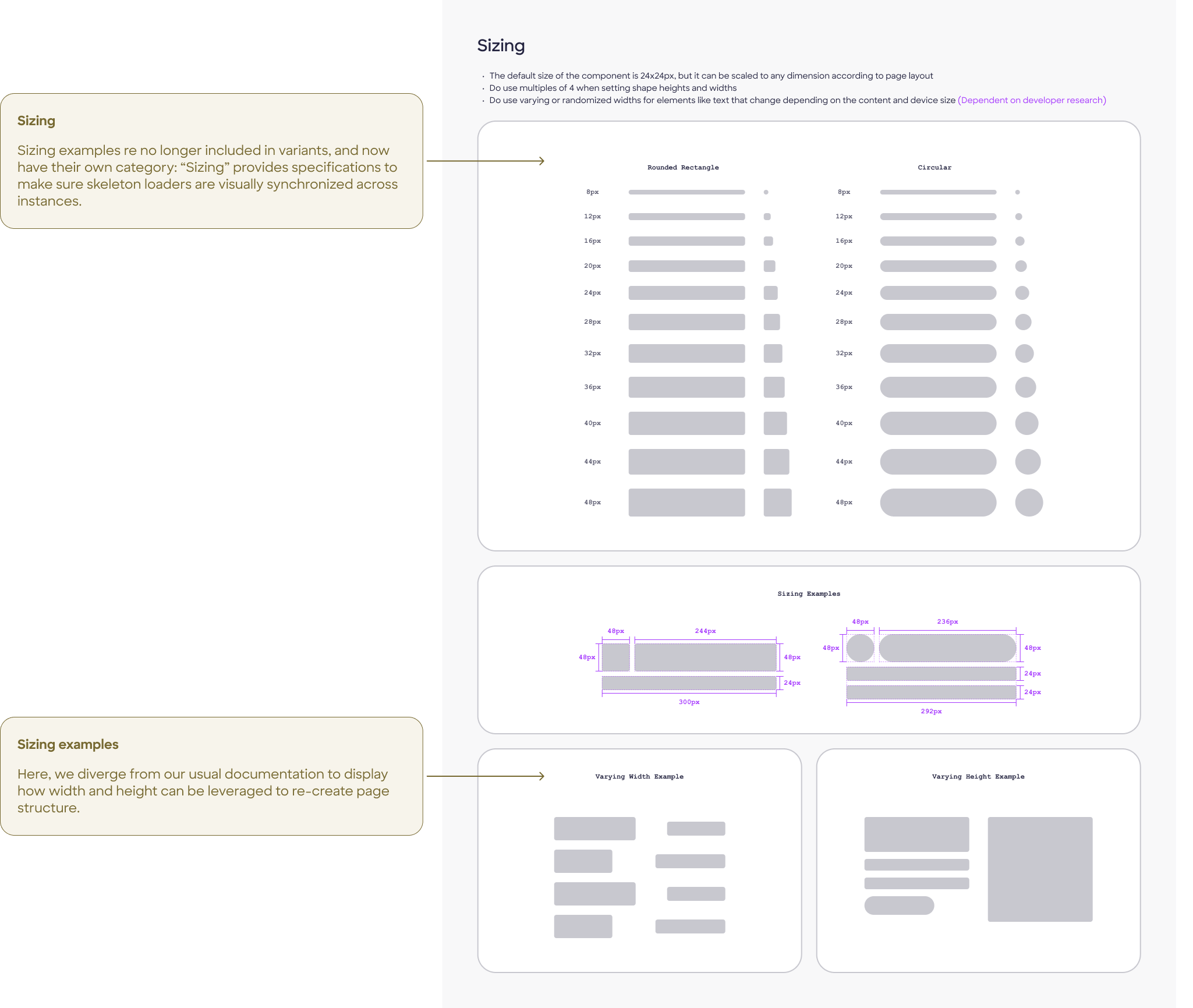
Once we had a clear recommendation for the design of the skeleton loader, we built out the component in Figma. In accordance with our design system's guidelines, we created a document detailing the component's default state, usage, anatomy, variants, sizing, positioning, and motion.
I tag-teamed with a UI designer to initially document purely visual specifications. After client approval, I would later begin accessibility documentation on the second-round approved design.
Final documentation

Outcome & impact
Shipped:
Built into Discover's official Storybook by development team
Integrated:
Development began on inclusion in AC Home page
Stakeholder reviews:
Presented to Discover's internal design system team 3 times
Unlocked:
10 subsequent component tasks led after this one
"The design system team both internally at FCB and externally at Discover was supportive of my approach. I was able to articulate my decisions and process to a degree of detail I had never before attempted."
The project ended when FCB's work paused following Discover's acquisition by Capital One. Subsequent components I researched and designed included a file uploader, dropdown menus, radio buttons, and tab/view control elements. Unfortunately, we saw the Discover app sunset before these could launch.

Learnings
The skeleton loader is a rule-breaker by nature.
It lives outside the normal component lifecycle and doesn't cleanly fit design system conventions. Being onboarded to the system at the same time I was learning when to deviate from it was both real challenge and real education.
Accessibility ambiguity requires documented, reasoned decisions, not just compliance or, worse, avoidance. Writing out the rationale for the contrast call made it defensible, not just excusable.
Comparative research is most useful when it surfaces genuine disagreement between systems (like Carbon vs. UX Collective on progressive population) — those forks are where design judgment actually lives.
Next time: It would be interesting to explore reduced-motion alternatives to the wave animation for users with vestibular disorders, and establish clearer thresholds for skeleton vs. spinner selection in the component's usage guidance.
Additional references:
Additional links: