


Annotation Toolkit
Year
Collaborators
Internal team: 3 total UXers, support from UI, Digital Strategy, Account, Project Management.
Keywords
Accessibility, design system utilities, Figma libraries and plugins
Year
2024
Collaborators
3 UXers, UI, Digital Strategy, PM.
Keywords
Accessibility, design system utilities, Figma libraries and plugins
Discover Financial Services (DFS) wanted their app to demonstrate best-in-class
accessibility technology, in order to support the maximum number of users possible.
For certain feature-level deliverables, Discover Financial Services preferred designs make
clear explicit affordances for accessible technologies: i.e., keyboard navigation, screen
readers, alt text, and other common digital technologies for users with disabilities.
Currently, Figma prototypes don’t account for frameworks/technologies like ARIA, screen
readers, or keyboard navigation protocols, so FCB was tasked with identifying a way
to statically represent accessibility via design annotations.

Why this mattered
This strategy needed to start from the bottom up,
i.e.,
accessibility
needed to be considered in early design rounds all the way to development and
launch.
Solving this problem was an exciting opportunity for FCB: we know the value of
accessibility, and wanted to find a solution that allowed us to visualize
accessible
design
for anyone who may need it.
Takeaways
It's important for designers to speak the language of developers when creating digital process. It’s also important that designers and developers get in the same room wherever possible, to make sure we’re aligned. Accessibility should be built into digital products every step of the way.
Protip: Annotate a design once it’s done.

Role
Research and systems design
- My roles:
- Conducting internal interviews to assess the current state of annotation practices across the team
- - Running stakeholder interviews with Discover's engineering team to understand their accessibility gaps and development workflows
- Evaluating and documenting four Figma accessibility plugins (Stark, A11y, Annotate It, Annotate Design) through hands-on testing
- Referencing WCAG 2.1 to map plugin coverage to compliance requirements
- Collaborating with the UI designer to draft the visual design for our own annotation utility
- Running stimulus testing on prototypes with internal stakeholders — designers and developers
- Synthesizing findings to simplify and finalize the toolkit
- Applying the toolkit across 150+ delivery files during component design and accessibility documentation
Research
Accessibility Gap
A few key knowledge gaps existed. All FCBers on the Discover account take a course on WCAG standards and principles. Our work was accessibility first, so we wanted to ensure everything we delivered followed the highest standards of compliance. We needed a way to scale accessibility for a large enterprise, so that WCAG is checked early and often in both design and development.
Internal interviews:
Our annotation process had been very ambiguous and nebulous up
to this point. We determined the rules as we went, depending on pre-existing client
preferences, internal talks and stated resources on a client by client,
project-by-project
basis. However, often times clients had a lower level of accessibility maturity than
ourselves.
We felt there was an opportunity to take initiative in accessibility, starting with
documentation.
Stakeholder interviews:
DFS had low accessibility maturity. Developers were reliant on Google for accessibility
questions, and uncertain of Discover’s internal compliance guidelines.
Junior Product Engineer
“The concept of accessibility feels brand new even after one year of learning. I still feel like a beginner.”
Senior Feature Engineer
“I’ve been working with [WCAG] on Discover for a couple years, but I’m far from expert. My level of confidence is moderate but growing. I often rely on Google for guidance as I go.”
Questions to resolve
- Where do we/do we not build in flexibility?
- Where does alt text change versus not change?
- What is the responsibility of the dev team versus the feature team with regard to accessibility?
- Where is the line and what gets lost in translation?
Field Research
The purpose of our earliest research was to identify which existing tools would help our workflow. We paid particular attention towards embedding accessibility features early in our processes.
-
The core aim of this research was to identify...
- how these tools could streamline our workflow
- how to automate significant portions of our annotation process
- reduce friction in making our outputs universally accessible
-
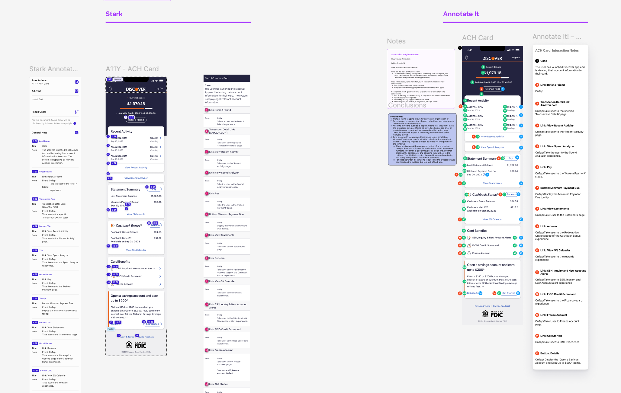
We evaluated four Figma Accessibility Plugins:
- Stark
- A11y
- Annotate It
- Annotate Design
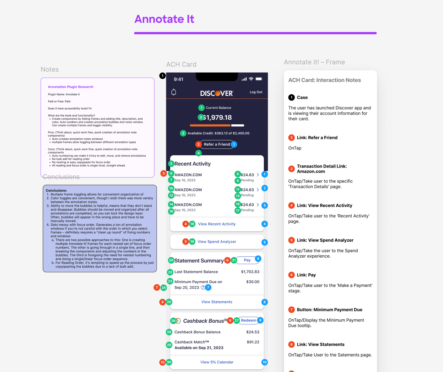
We recreated annotations for the Discover app’s landing page, Account Center Home, using all four plugins in order to evaluate structure and performance.
This helped us determine not just which plugins were helpful, but what key accessibility rules they described. From there, we drafted an outline for our own annotation toolkit, which we built in Figma using our field research as a guide.
Questions to resolve:
What makes the process feel intuitive, rather than grating? What features perpetually recur, and which are variable? How does the output visually occupy the frame?
WCAG Reference
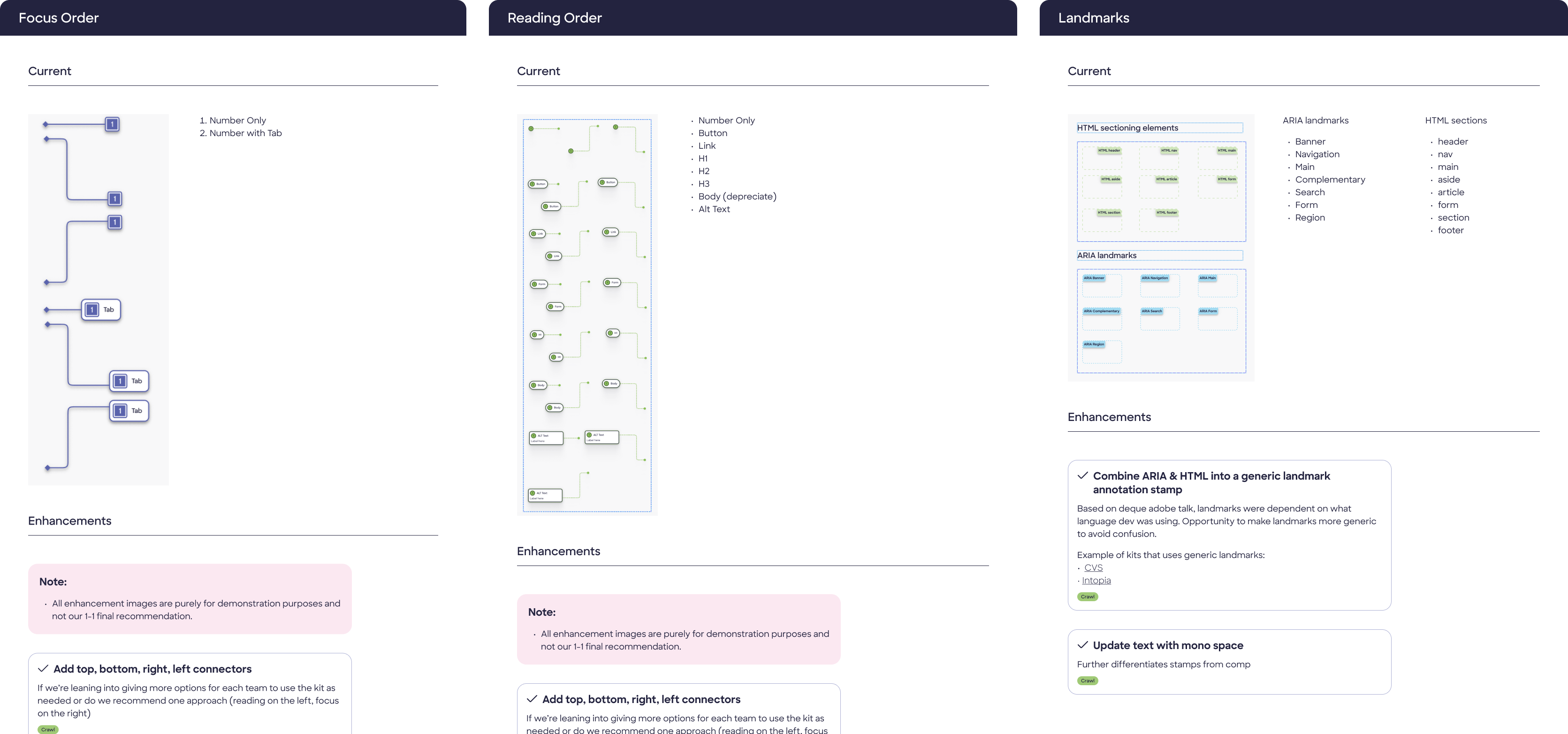
We cross-referenced the Web Content Accessibility Guidelines (WCAG) 2.1 with early designs to ensure our toolkit aligned with industry standards and best practices for accessibility. We found that the plugins we tested covered a lot of the same ground as the WCAG guidelines.
-
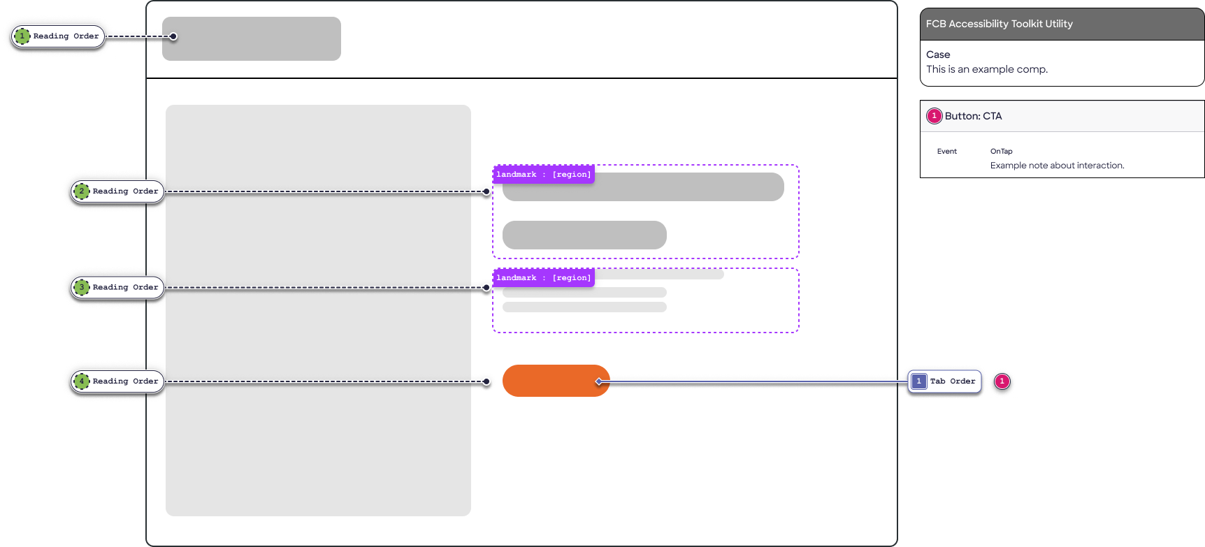
Recurring elements:
- Focus Order (Keyboard navigation),
- Reading order (Screenreader voiceover),
- page landmarks,
- interaction details.
Now we had content guidance. We began to draft documentation and UI for our own annotation utility.
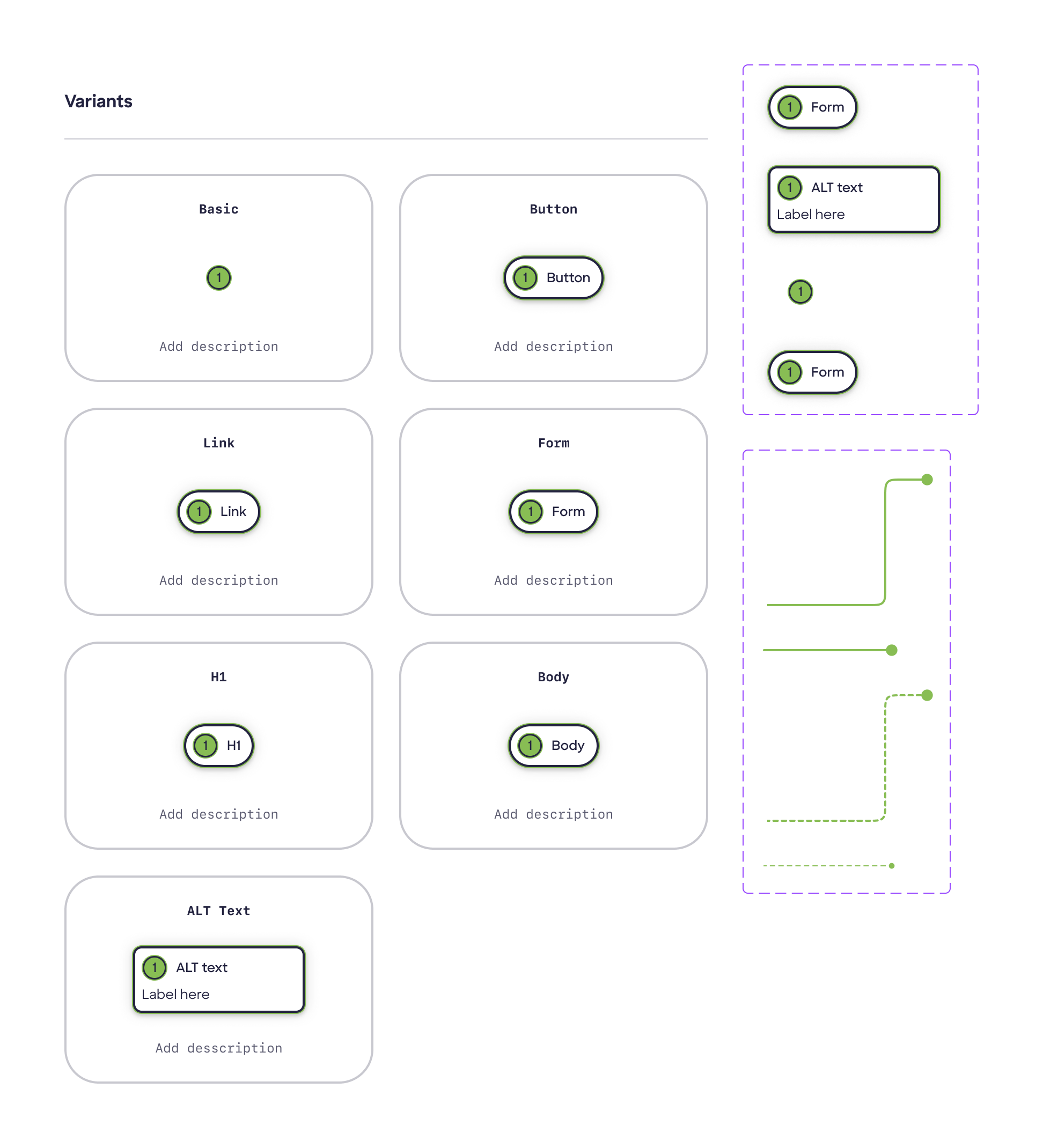
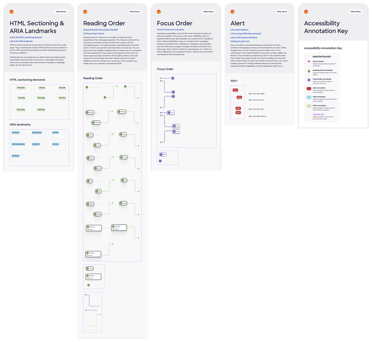
Building the toolkit
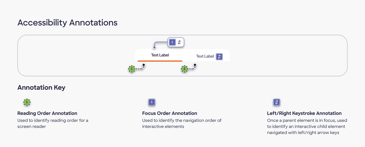
UI and UX began outlining the visual design for the annotation utility. We used a "stamp" system instead, built as a Figma library with reusable components with variants and properties affording a wide range of placements on the canvas.
Design decision
We decided to forego automated plugins. Our stamp system allowed for more long-term control and flexibility, more suitable for an evolving system.
The highest level of specificity was made possible by manual annotation, and we were able to automate a lot of the process to prepare for future plugin integration.
We also wanted to make sure our annotations were primed for growth with future clients, so we started with foundations before stretching into automation.
Stimulus Testing
We tested the toolkit with internal stakeholders, including designers and developers, to gather feedback on its usability and effectiveness in communicating accessibility features.
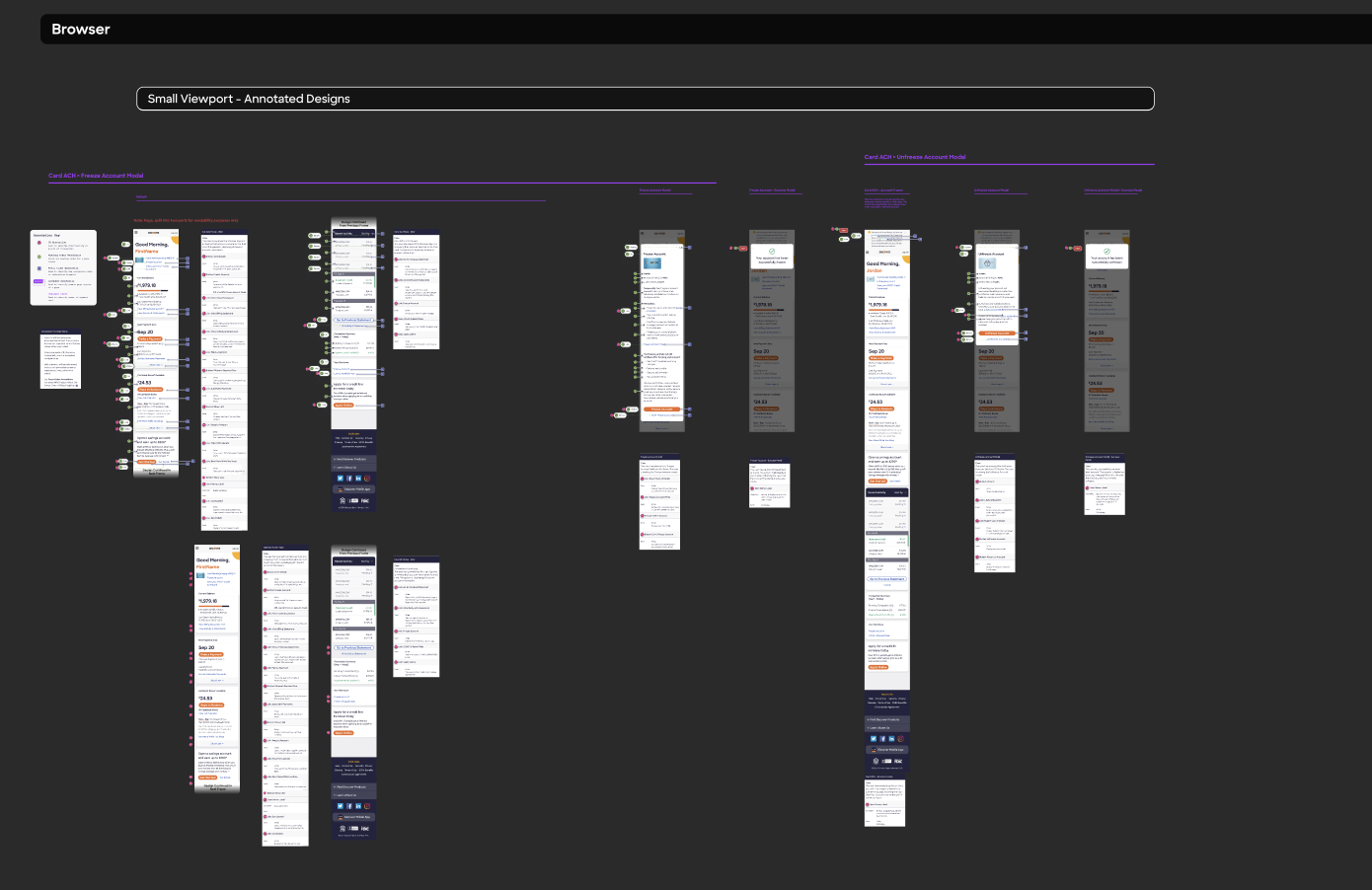
After assembling this list, we started by trial-annotating the existing in-app landing page, attending to responsive differences across devices.
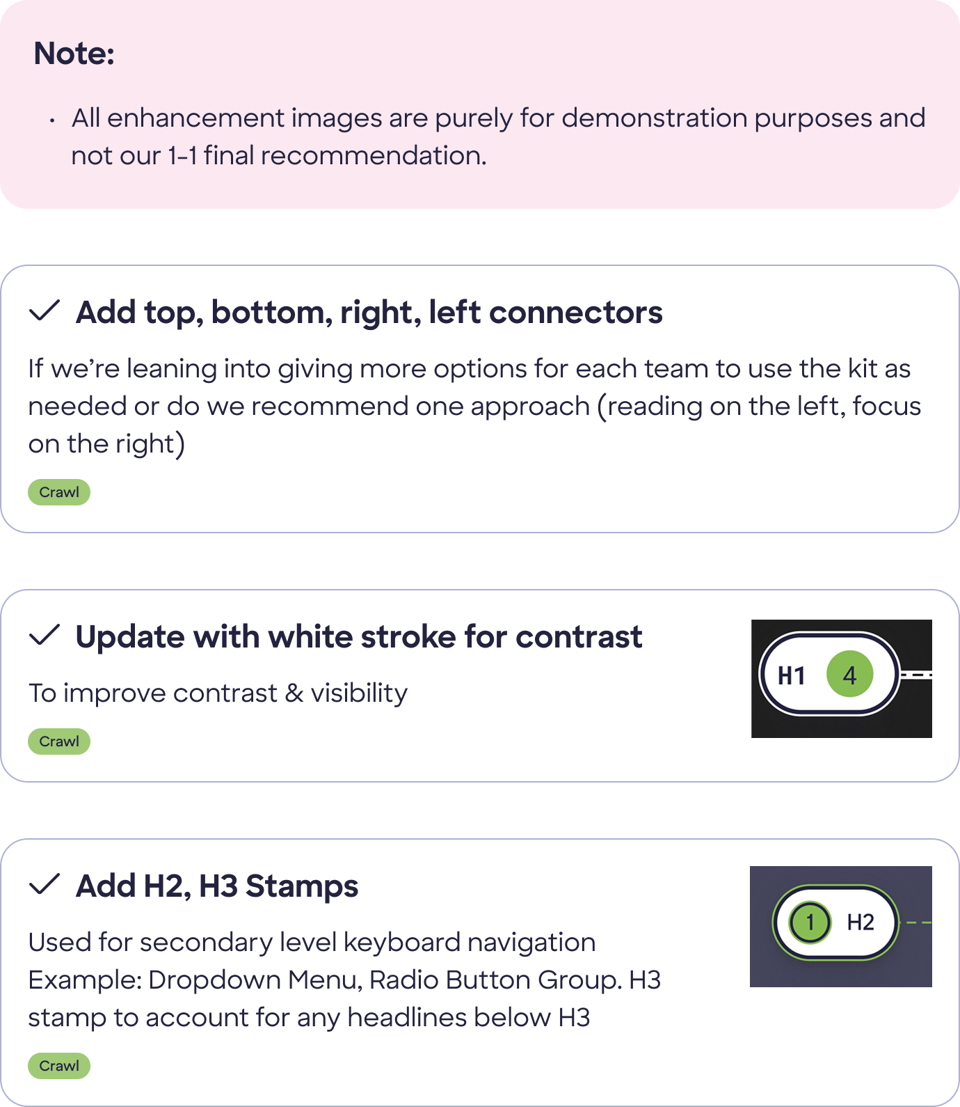
Stimulus Testing Results
The stimulus testing revealed that the toolkit was effective in communicating accessibility features to users.
However, it also highlighted areas for improvement, such as the need for more simplified visual cues.
Developer stakeholder feedback clarified some redundancies: e.g., that ARIA affordances are made at the feature level and don't need to be documented in designs. We were also able to drastically simplify our annotation process by confirming with developers that Business-as-usual elements (that is, elements that repeat across a feature) don't need new annotations everytime they appear.
Final Design
The final design of the toolkit is a published Figma library with reusable components that can be easily applied to any design. The toolkit includes a variety of stamps for different accessibility features, as well as enhancements for more complex annotations.
We made sure our documentation followed the same organizational logic used by the rest of the design system.
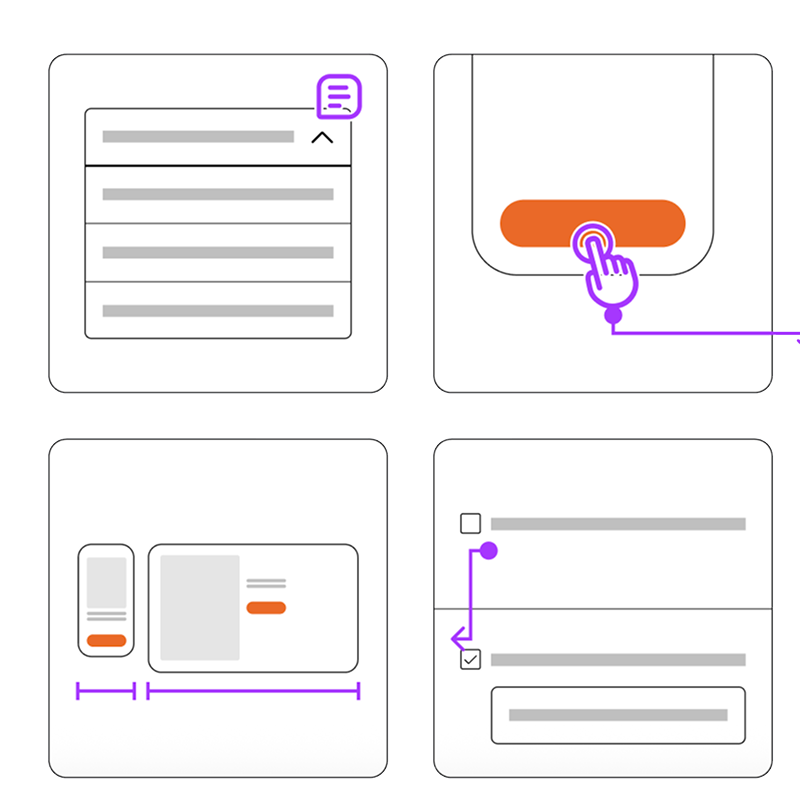
Usage Examples
The following are examples of how the toolkit can be used in practice:
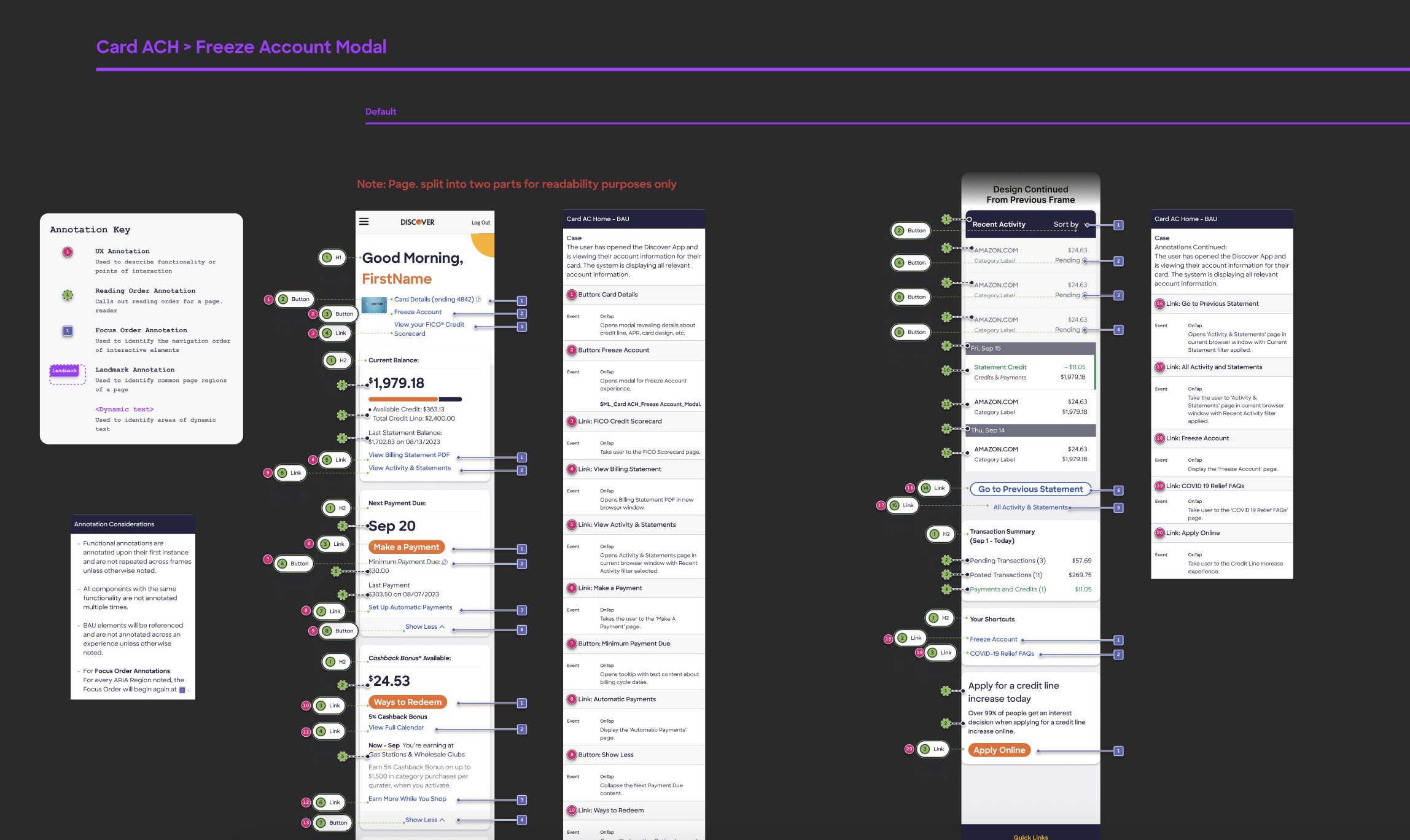
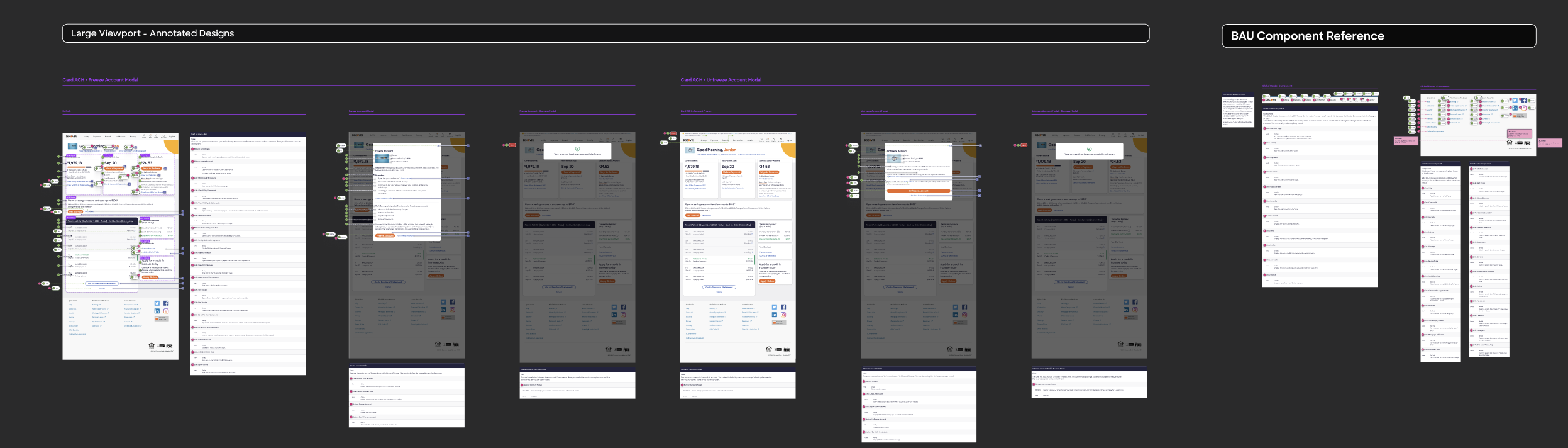
True to form, our toolkit proved robust and helpful. While building the RDS Design System, we made sure a round of accessibility annotationwas included at the end of the design process for each component we touched. By way of example, below are the accessibility annotations for the “Tab” component I worked on.
Accessibility Considerations:
(Direct quotes from documentation)
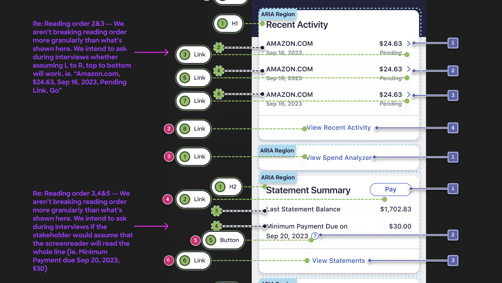
Keyboard Focus (Assistive Technologies)
``` On page load, the leftmost, first tab is selected by default.
If the user selects another tab, navigates away from the component and then returns, focus should retain the most recently selected tab
There are two tab stops: one for the tablist, one for the tabpanel.
When focus moves into the tablist, place focus on the active tab element.
On load, the the leftmost tab should always be active by default.
Navigate between tabs in tablist with Left and Right arrows. Activate a tab with Spacebar or Enter key(s).
´´´
Screen Reader (Assistive Technologies)
``` Upon focus on each list item, assistive technologies read out as follows: tab label, < tab>role, < tablist> role, order in tablist and total number of tablist items. Only read selected state if applicable.
Examples:
If current tab (“Menu”) is not selected, read “Menu, tab, group, one of three.”
If selected: “Menu, tab, selected, group, one of three.”
As user navigates across list with arrows, read each tab label.
When a new tab becomes active, read “Selected, [tab label]”.
´´´
Learnings and Takeaways
Annotations benefit large efforts and/or large audiences by providing clear documentation. They encourage collaboration between design, development, and business; and they ensure alignment on the user experience.
This was my first foray into design operations. The result isn't a flashy live feature, but it allowed us to rapidly improve output and consistency in our delivered files. The UX team was able to solve a problem that had been lingering for a while. It was also a great opportunity to collaborate with developers and get on the same page about accessibility best practices.
Pro tip: Annotate at the end of the design process!
After annotating 150+ delivery files, I can safely say that it's a lot easier to deliver annotations with R2 designs, once the design is finalized. That way, you're not stuck adjusting as many as 72 reading order stamps by hand after a new section is added to the top of the page.
In sum:
I'm, grateful for everything this process taught me about thorough, rigorous accessibility planning. Knowing the WCAG Guidelines in theory had been all well and good, but having a deep working knowledge of the details of the requirements has been invaluable in making recommendations to clients, developers, and fellow designers alike.
Additional links: